Filling out product cards for an online store
Rules for filling out product cards in the online store
In order for a product card to turn a potential buyer into a real one, it must attract attention and be understandable. Product card should also has all answers to possible user questions and describe the features and benefits of the product. Reading the article, you will learn how to correctly fill out the product card for an online store, so it ensures a high conversion.
Card structure
Arrange all elements of the card logically in relation to each other. Product pages should have a uniform style that does not stand out from the design of other sections of the online store. Use the same fonts and color combinations. So the user will quickly get used to them and will pay more attention to the content of product pages, and not to their design.
If possible, use the classic structure:
• on the left — photos of the product;
• on the right — brief information, product price, purchase button;
• below the first screen - additional information, reviews and all other elements, such as product recommendations.
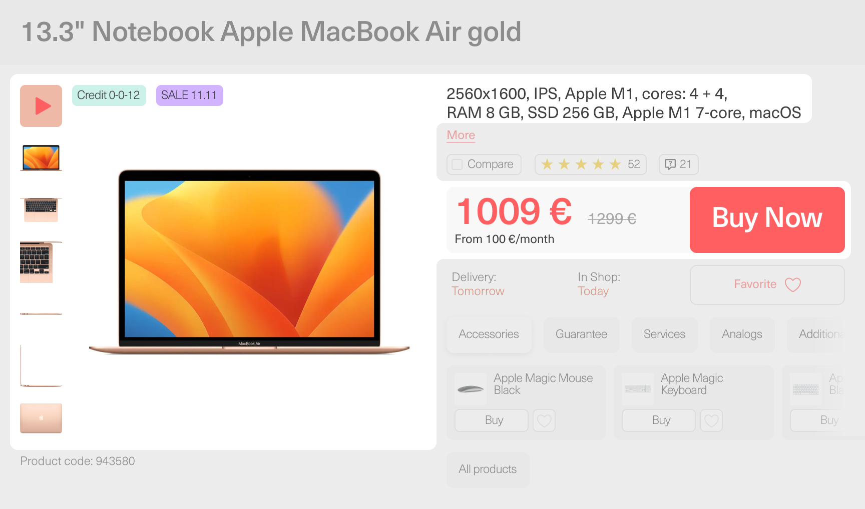
We didn’t make these rules. The structure has spread due to research showing its effectiveness. The user examines the content of any page on the Internet from left to right and from top to bottom. Therefore, you need to arrange the elements in such a way that the buyer receives information in a logical order. First photo, price and brief information. Then additional information, answers to possible questions and elements that increase trust and conversion.
Product name
Whether the user will carefully read the name of the product depends on its category. However, it is the key for the search. The name should give an understanding: what kind of product it is, and whether it fits the general request of the buyer.
The name is assembled as a constructor according to the formula: product category + brand + model + distinctive features.
Examples:
• Smartphone Samsung A10 white, 4/64 GB.
• Dress Befree in light beige.
• Steamer Braun FS 5100 in black.
Some elements from the formula can be excluded if they do not fit the product. Sometimes it is worth adding a quantity or other important information. But the title should remain short, clear and easy to read.
Photos and videos
Filling out the product cards of the online store requires the mandatory placement of photos. They must be high quality and high resolution. Bad photos will instantly alienate the buyer from the product or even from the entire online store. They subconsciously cause mistrust. Two good photos are better than a dozen of bad ones.
To choose illustrations for the product card, please, follow the recommendations:
• Take photos from different angles. Front, rear, side, three-quarter turn.
• Add lifestyle product shots that show the product in use. If this is an electric grill, it should be in the kitchen, captured in the process of cooking meat or vegetables. If it is clothing, at least in one picture it must be on a live model, and not on a hanger or mannequin.
• Add photos with details. For example, if it’s appliances, post pictures should show how some special features work. In the case of clothing, show closer the texture of the material, seams, buttons, and other eye-catching elements.
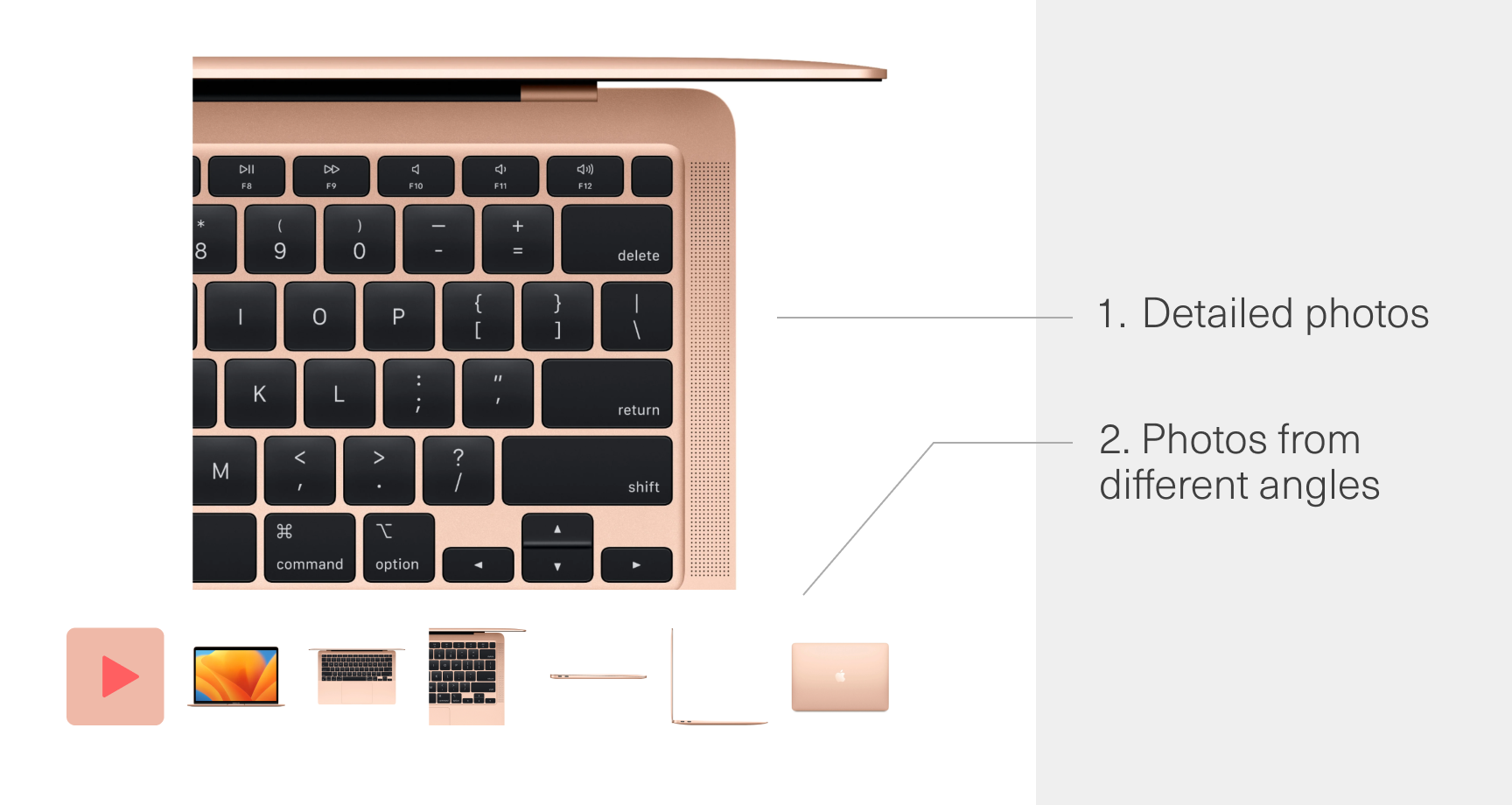
If the photos are high-resolution, add a “magnifying glass” so when hovering over the photo, the user can see the selected area zoomed in and view the product in details.
A video card will get more attention than a photo-only. Therefore, if possible, make a short video demonstrating the key advantages of the product. The longer the client examines the product, the stronger his confidence in the online store and the desire to purchase the item grows stronger.
Description and characteristics
Without a good description, filling out the product cards of an online store will not work. Even if it is a small everyday product, the functionality of which is clear. There should be at least a small text, since users are used to seeing it in cards.
In any case, a short description should be placed first, including:
• information about how the product is used;
• information about the materials from which the product is made;
• the main features that distinguish the product from the rest.
Most buyers will pay attention to this text, so it should be as capacious as possible. About half of the customers of online stores are ready to read a long, detailed description of the product, therefore, its presence increases the conversion. If the buyer reads a quality description that answers their questions and puts the features of the product in a favorable light, the likelihood of a purchase increases.
Separate the block with product characteristics from the rest of the information. It is best to make a list. Place the most significant characteristics above, unimportant ones below.
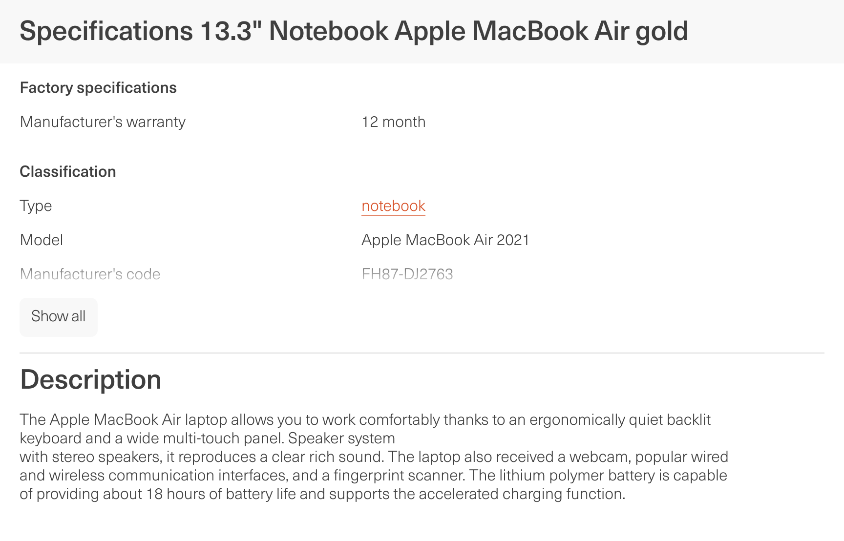
For a quality description, follow the recommendations:
• write in simple, understandable language, without using terms that your client may not know;
• indicate all the key features of the product, not just list them, but explaining what benefits they will bring for the buyer;
• divide the text into paragraphs, and if it is voluminous, add subheadings and insert pictures between key blocks;
• do not forget that the text in the product card should not only provide information about the product, but also encourage customers to buy it.
The higher the price of the product and the more complex it is, the more attention buyers pay to the product description. Not everyone will investigate the features of an inexpensive mug. But when buying an expensive refrigerator, the consumer will probably want to study its distinctive features thoroughly.
Additional elements
It is important not only to fill out the product cards of an online store with basic information and photos, but also to add more functional elements, as well as to make them more efficient.
“Buy” Button
Buttons with a call to action - “Buy” and “Add to cart” should:
• be located in a conspicuous place;
• attract attention;
• be bright and contrast to the background.
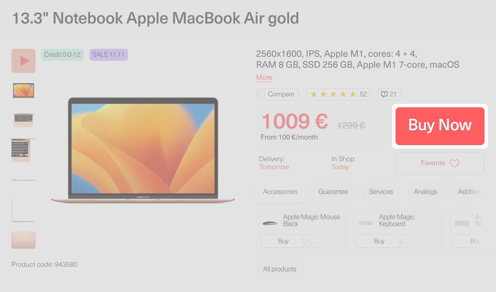
You can place both at once or choose a more suitable option for your online store. Also on the product page, if possible, place a one-click buy button. When you click it, a form should appear that allows the customer to enter only the most necessary data and complete the purchase in one step.
Feedback block
The most important element of the product card, the purpose of which is to give the buyer the opportunity to make sure that his choice is correct. The presence of reviews will show that the product is in demand. And filling them with text and real photos will increase the credibility of the product.
Additionally, you can add a rating function on the product page. Let every customer who leaves a review rate it. The average rate can be displayed above the reviews block or above the main product card.
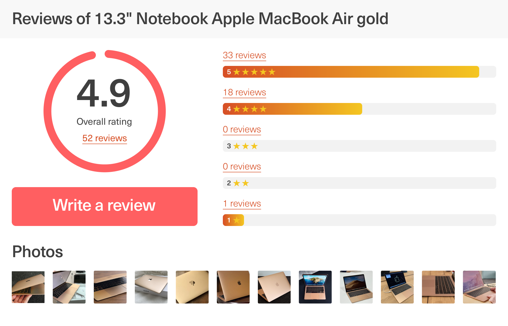
Do not delete reviews with the slightest criticism. Consumers have different goals when buying products. What might be a minor disadvantage for one client may not bother another at all. At the same time, in the same review, the benefits that can “hook” the person for whom they are important will also be noted.
Negative reviews should be dealt with competently, publicly offering the client a solution to his problem - this will increase the credibility of the online store. Consumers will know that in case of emergency they will be able to get help, and will not be left alone with their problem.
Marketing tools
Website owners often forget about additional marketing opportunities when deciding to fill out the product cards of an online store in detail and comprehensively. However, these tools increase conversions and customers loyalty, help them make a choice, encourage them to purchase additional products.
Let’s consider the main marketing tools:
• Product recommendations. This block can display additional accessories (for example, covers and headphones under the smartphone product card) or analogues of the main product. In the first case, you increase the likelihood of an additional sale. In the second, you work to retain the consumer if he did not find what he needs in the viewed product card. You can also add a “viewed products” block so that the client can easily find the positions that he has viewed before.
• Stickers “New”, “Top Seller”, “20% Discount”. They must reflect the actual features of the goods. So if the client is looking for a good deal, he can pay more attention to discounted options. And if he needs an option tested by other consumers, he could simply buy a best-selling product.
• Field for entering a promo code. It is necessary if some of the customers know in advance the code word for participating in the current promotion. At the same time, a consumer looking for an opportunity to save money may be interested in this field and, as a result, still buy the product, having found the possibility of issuing a discount.
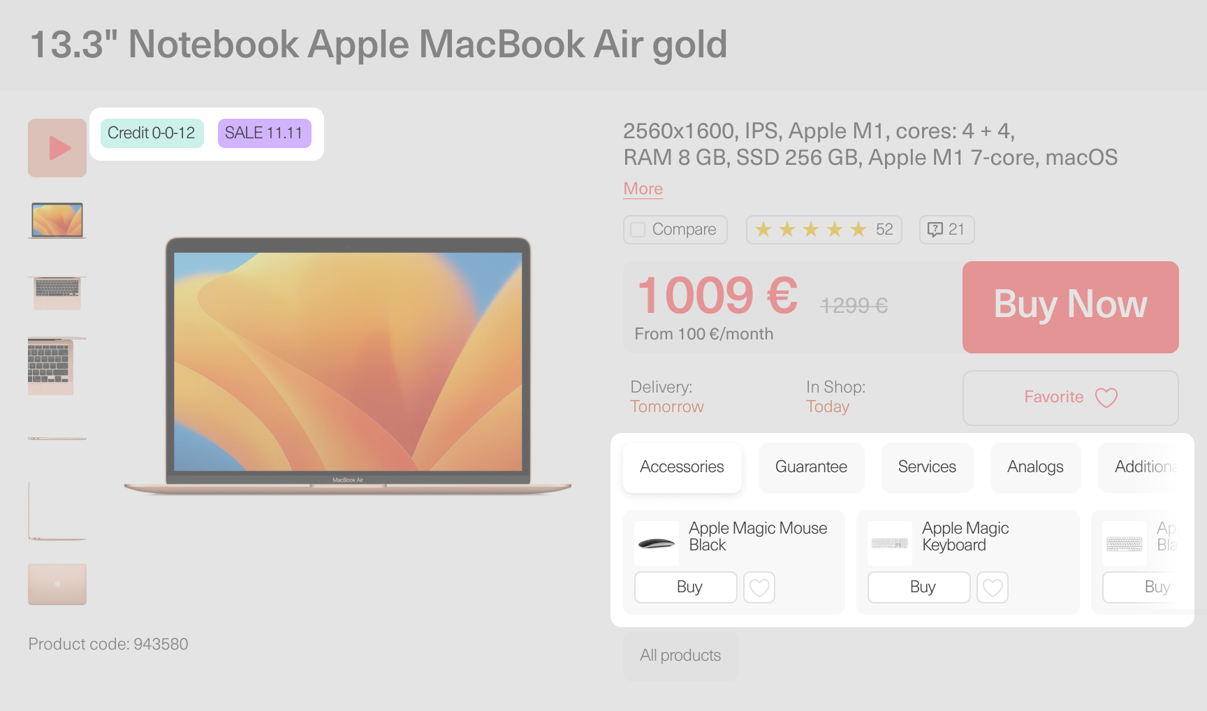
If you have free shipping, indicate this when creating product cards. Especially if this opportunity appears for a set of products or a certain price. Then the customer will be motivated to purchase additional products.
After implementing these marketing tools, you can be sure that you have really got a selling product card, and now the conversion into a purchase will be higher than it was without using the features described above.
Function buttons
Try to make the product card more functional. To do this, you can add a number of buttons:
• “Add to Compare”. A useful feature that makes sense if the products you offer can be easily compared in some way. For example, this makes sense for washing machines - they differ in capacity, number of revolutions per minute and other well-understood parameters.
• “Share on social media”. A button for quickly sending a product card to friends to get advice on a purchase or brag about the purchase. Attracts additional traffic to the online store.
• “Add to Favorites”. If your customers have an account on the platform, give them the opportunity to save products for the future. So they can easily find them when needed. Moreover, the very presence of such a button can encourage the consumer to create an account.
• “Add to wishlist”. If for any reason customer have chosen the desired product, but is not ready or able to finalize the purchase straight away, he will have opportunity to come back to shopping, while skipping the searching phase of it.
• “In stock alert”. Helps track product availability. Allows you to keep in touch with a customer who is interested in your product even if it is out of stock. Alert helps attract customers back to your shop quickly as well as collect contact details of a potential customers. Useful tool for a high demand items, that can be out of stock regularly.
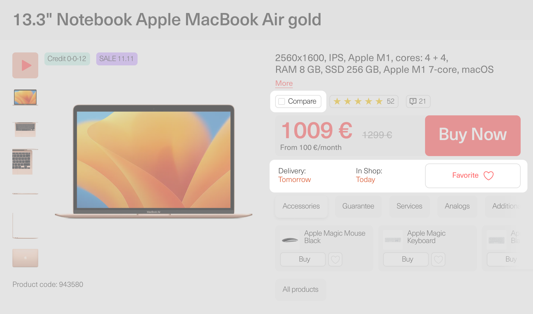
Choose the buttons that are suitable for product card design in your online store in order to increase its efficiency.
3 extra tips
Before summing up, here are three small but important tips:
• If the same product is available in different colors, make one card with the ability to choose the desired color instead of several almost identical ones - this will make navigation easier.
• When you need to design a product card quickly, you should not copy the text from a competitor site - it’s better to leave the field blank first, and add a description there later. Other business’s texts can have a bad effect on the SEO performance of your online store.
• To simplify the navigation, use “breadcrumbs” - the name of the element that shows the chain from the main page of the online store to the section or card that is currently open.

And it will not be superfluous to see examples of how the leaders among the online stores in your category fill out their cards. Among marketplaces, this is Amazon, bookstores - Textbookx, hardware stores - Walmart, and Zolando among clothing sellers.
Summary
It cannot be said enough that the description of the product card is more important than the photos. Or that marketing tools are more effective than a well-designed buy button. If the task is to fill out the product cards of the online store, you need to approach it comprehensively.
Only competent and comprehensive content will help the client to be 100% sure that the product suits him. Make sure that the selling card of the product complies with the rules from the article, and conversion will soar.